Why I Love Webflow – A Designer’s Best Friend

Webflow: The Page Builder Designers Have Been Waiting For
For as long as web pages have existed, there have always been two departments that needed to work together to create one project: Designers and Developers. In my previous article, Adobe Illustrator for Web Designers, I talk about the communication difficulties between these two and how to become more efficient in the collaborative workflow. As a designer and a DIY kind of guy, I am beyond happy to have finally found a program that allows a designer like me to actually BUILD the front end of a custom website by myself: Webflow.
For Grue & Bleen, we build mostly on WordPress because it is open source and has so many customizable plug-ins; however, for some projects, we do not require all those capabilities and turn to Webflow to build sites for our clients (and ourselves). When we do have a Webflow project, I can design right inside the Webflow interface as it builds the code. What sets this apart from a CMS, such as Squarespace or Wix, is that Webflow offers a direct hybrid of designing and coding, where you can get as deep into the CSS and JavaScript as you wish for ultimate customization. I have compiled my list of eight things I appreciate most about Webflow from the standpoint of a designer who is also lightly familiar with code.
1. Easy Drag and Drop Modules
This is the part of Webflow that is very similar to page builders like Squarespace and also visual WordPress plugins like Beaver Builder and Divey. You basically have a list of elements you can drag onto your page to start building a custom site.
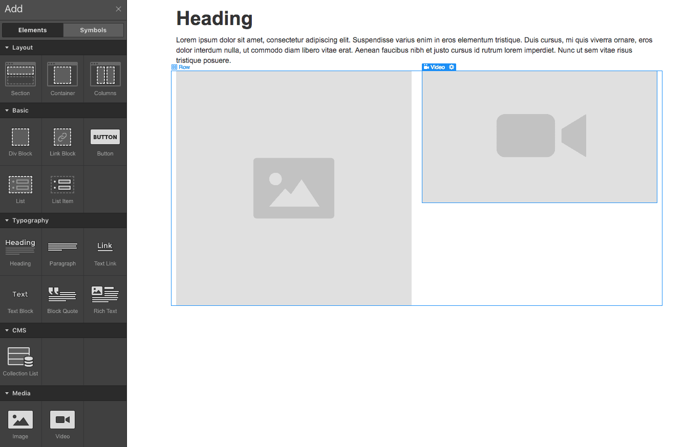
What I like so much about the Webflow modules is that they make it so easy to build your layout structure according to how a developer would approach it. First you start with a section, then you insert a container within that section, then a row of columns inside the container, then a div block inside the columns, then continue on with content like text, images, or videos. As if being able to set up your page structure from the ground up wasn’t easy enough to keep track of, Webflow has an entire side tab devoted to the site hierarchy. This makes it so simple both to understand how elements are nested and to rearrange elements by dragging. These modules are by far the most extensive and intuitive I have seen in a page builder. From simple elements like headers, paragraphs, and images to more advanced items like sliders, dynamic lists, lightboxes, and forms, Webflow has everything you need to build something easily from scratch.
2. Easy to create classes and subclasses
Webflow makes it so easy to give every element you place onto the page (including sections, columns, divs, images etc.) its own unique class for styling. A lot of times when you are working in WordPress and want to make style changes to an element in the CSS, the targeting gets really complicated. For example, if you wanted to restyle the background of your navbar on a WordPress site using CSS code, you may have to sift through the inspector of the page to find the class target: “.fl-page-nav-right.fl-page-header-fixed .fl-page-header-container.container, .fl-page-header-fixed .fl-page-header-container.container.”

If you were building in Webflow, all you need to do is name the class of your navbar container something like “navbar-container” and that will be the exact target you can use in CSS and JavaScript. The ability to give everything a class (and subclass) with the name of your choice makes it very intuitive to go into the code of your site to modify things.
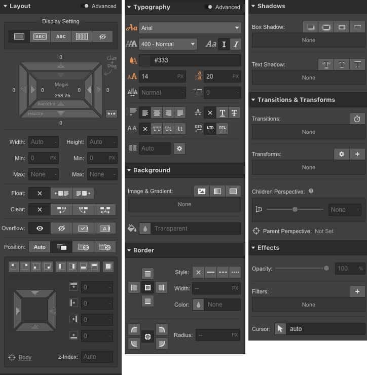
3. You can control most CSS properties in the style editor
Once you assign a class to something, you now have the ability to use the style editor. This is the aspect of Webflow I find saves the most time and gives the most direct control over the properties of an object. In this panel you have access to not only the basic properties like font, color, padding, and margins, but you can also edit parameters like positioning (absolute, fixed, relative), advanced text options, drop shadows, and filters. This makes the need to go into the CSS code almost unnecessary and you can intuitively adjust while watching the changes update in real time.
4. Hover States are easy to control
Creating hover, visited, and focus states are just as easy as adjusting the normal parameters of an object. All you have to do is change the dropdown of your class to a different state and then make your adjustments to the parameters you want changed. So you can essentially create an entirely different looking object on hover by changing all the parameters using the same process of creating a new class. Not only that, but you can even insert a transition between states in the form of a time frame, so rather than having the parameters change immediately upon hover, you can set a 200ms ease that makes it a little less jarring. Think about how long it would take to phrase that all to a developer and how you, as a designer, can accomplish this all in a manner that makes the most sense for you: visually.
5. Animations/interactions
With animations and interactions built into Webflow, you have the ability to create subtle and complicated user-interactive elements that would normally be done using scripts. This eliminates the hours of discussion you would have to have with a developer that would start with “Could you just…” or “Would it be possible if…” Now you can make your static website come to life in a highly customizable way.
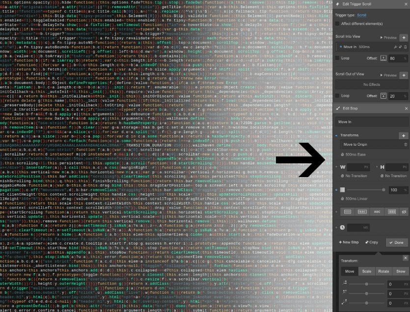
Most page building platforms will allow you to apply animations to an object by selecting something from an “animation” dropdown, which may include things like fade in, slide in, bounce etc., but most of the time you will not be able to have any control other than turning it on or off. In Webflow you can get so deeply into the customization of your interactions that you can accomplish things only an experienced developer would be able to code.For this example, I will use fade in to illustrate how you can customize it. Not only do you have control over how long it will take for this object to fade in, but you can have control over what triggers the action. Maybe you want it to fade in starting when the page loads, or when you scroll into view, or when you hover over it. Maybe you want the fade in to start when you click a completely different object. This is the kind of thing you would only be able to visually accomplish through a program like Adobe Animate (formerly Flash). The list of interaction types is substantial and not only are they all customizable, but they are stackable so that you can have multiple applied to one with a web of connectivity between other elements on your page.
6. Symbols – global styles updated
Symbols are a great way to create elements that you will reuse throughout your site. A common use is for headers and footers, but can also be used as a template section, sign-up form, or custom module that you will have use for on other pages. The best aspect of symbols is that the style changes you make on one will automatically update across all pages. But what if you want to have an instance of a symbol where you want to further customize an element without affecting the other pages’ symbols? Simple! You can select an element inside your symbol and unlink it so that you can make changes only applied to that one instance.
7. Ability to customize every property across different devices
In today’s world of mobile internet browsing, it’s never been more important for your website to be optimized for all devices, and Webflow makes it so easy and intuitive to design responsively. You have the ability to make all style changes in your elements between four different devices (desktop, tablet, mobile landscape, and mobile portrait). The way it works is that you can preview your design on each device and then use the style editor to adjust all the CSS properties to make the design make sense in all formats. Basically what Webflow is doing is creating media queries for you (you can also adjust your breakpoints) that tell the CSS properties to change based on what device your site is being viewed. This kind of responsive customization is possible on other platforms (like Beaver Builder, and very extensively on Unbounce), but most of the time your CSS changes across different devices may be limited to simple parameters, like padding and margins. In Webflow you can change everything in the mobile and tablet designs that you are able to change in the desktop design. This becomes very useful when you want to change text formatting, pixel dimensions, background images, or hide objects on the mobile version of your site.
8. Background images
Last but not least, I would like to express my appreciation for the way Webflow allows you to use background images. Background images are the key to creating compelling full width heros and also making your pictures responsive. When you are applying a background to an element, such as a section or a div, you can use the background image option and from there decide on how the image sits inside the element.
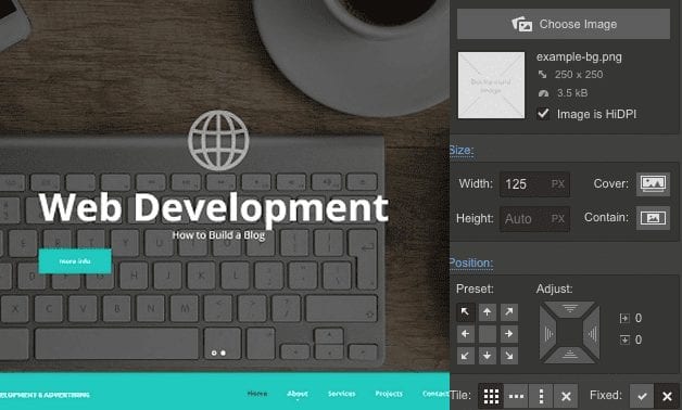
One of my favorite ways to use this feature is to make the background image a cover image. This means that no matter what size the container is, the image will fill the full width with no blank space and stay in proportion. This can be so useful when thinking responsively because your containers may change size across different devices and your background image will stay within the boundaries like it is being cropped and scaled to fill the container. That way you can have images of all different heights and widths but still fill your equally sized containers for a clean look that will stay clean and in proportion in the different device designs.
Like all the other CSS properties, you can edit the parameters and positioning of the background image across the different device designs. This way if your image looks the way you want in desktop view as a cover image, but cropped badly in your mobile view, you can adjust the position of your background image and the container will remain the same, but just change how the image is displayed. Also you can completely change the background image in the hover state of an object, giving you freedom to make some really creative interactions with pictures.

All in all, I would highly recommend Webflow to designers who are looking to build their sites from scratch. As a designer I always feel suffocated by platforms like Squarespace and Wix because I feel they were created for people who want to trust the templates and then just make minor changes. The templates are not designed to be rearranged or changed much at all, but are more of a swap-out-content workflow. Though Webflow does have a nice choice of templates, it really excels in the customization aspect and is especially good for designers to work from scratch. It is also a good starting point for designers thinking about getting into coding. Though it only begins to scratch the surface of web development, it works as a good insight into some things that front end developers may think about as they are creating a custom site.

About Great Big Digital
Achieve your website goals with customized data, intuitive UX, and intentional design.