The Ultimate Guide to Image Optimization for Web Design

As a designer, you understand the importance of imagery when designing a website. It adds emotion, branding, special effects, personality, and dimension that can wow your clients. And it’s a lot of work to find/shoot the right pictures, create the beautiful custom graphics, and work custom imagery into the design and flow of the page in an engaging way.
Once you’ve handed your design off to a developer, your work is all done right? WRONG! There are a few more steps you can take that will make the development team love you so much, they’ll always want to work with you on future projects. Those extra steps are all about image optimization for the web.
What is image optimization for websites?
Image optimization is all about reducing the file size as much as possible without losing too much quality. That’s pretty much it. It’s making all your assets, like the pictures, graphics, icons, and video (video optimization is a separate topic) as lean as possible. You can do this in a few steps:
- Image Cropping – Getting rid of the parts of the images that will not be visible in the final design or build of the pages
- Image Resizing – Proportionally shrinking the pixel size to match the dimensions in the context of the site’s actual structure
- Image Compression – Using software or plugins to reduce the file size
Methods of image optimization
Though there are many methods for accomplishing the above 3 steps (such as using different softwares, site plugins & scripts, or web apps), I will primarily focus on using software like Adobe Photoshop and Illustrator (or similar) as your optimization tool.
I will, however, get into some alternative methods and other tools out there later in the article.
Why is image optimization important for websites?
Imagery is great, but there are drawbacks
Large, colorful, crisp images are great elements in the design to dazzle your client with a visual experience and a unique flare. When you show them those high res PDF mockups, they love it of course because you’re an artist and visual design is what you do!
But… what happens if the site-building dev team starts creating the site with all these large, raw image files? Issues… that’s what.
You did an amazing design job! But you’re not done yet…
You may be a freelance designer, work for a branding agency, or work alongside an in-house development team. You may already understand the concept that a site’s design is only as good as what is actually built. But if you are not familiar with site performance in relation to images, here it is in a nutshell:
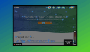
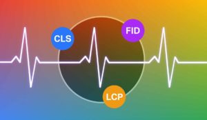
Excessively large image file-sizes will slow down the loading time of the site, which creates a bad user experience and is actually punished by Google. Yep, that’s right, the site ranks lower in search results when the PageSpeed has a low score.
Be a team player with the dev team

You may not think stuff like site speed and optimal performance affects you personally as a designer because technically your job is over once the mockups are approved, but just keep this in mind: A development team knows they need to keep everything lean for site speed and they’re not always readily equipped to compress, resize, and crop images. They will remember that you handed them large, bulky, uncropped images and had to do all this extra work to optimize them themselves by using site plugins and scripts. Make them love working with you by saving them hours of work!
As a professional-level designer, your job is not only to create a stunning design and great user experience, it’s to ensure that it’s possible for it to translate to a website effectively.
Before I get into the how-to’s, techniques, and best practices, the first thing you need to do is assess the assets in your designs. It’s not as simple as just running every image through a compressor and you’re done – each asset requires a specific strategy for optimization.
Consider the type of images/assets you are working with
I’m not talking about the file type, I’m referring more to a category of image in context of the page designs. These warrant different resizings, croppings, compression types, and file types. I like to group web images into these 3 categories:
1. Hero and full width background images
These are those large scale images that stretch from edge to edge of your browsers. Titled “hero images,” these are most commonly used as a large banner at the top of a page; however, they also may be used in other sections. They are flexible images that automatically crop differently depending on the browser width and the development coding.
These images have a rocky relationship with business clients because of the fact that they appear differently on all devices. When they look at the final site on their laptop, they may ask you “why does this not look exactly like it does in the design?!” As a designer, it is very helpful for you to convey the functionality of background images to the client when presenting your design mockups. This will give them the heads up that some things will just be inconsistent across browsers and devices and put their minds at ease when the final site is built.
As a note, these are the most difficult images to optimize because of how jumbo-sized they are intended to be and the fact that a large monitor might extend the width to such a high pixel size. We’ll get to that later, though.
2. Contained images
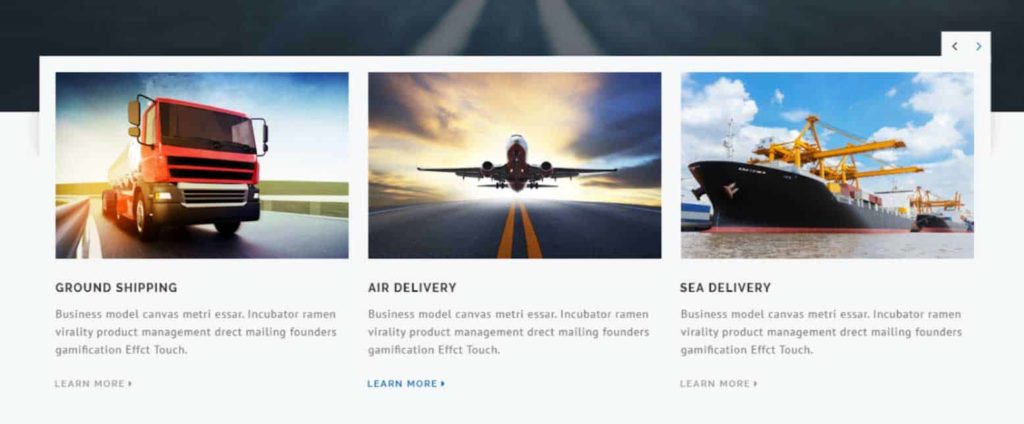
These are different from background images because they are a fixed size and will appear mostly the same across different devices. The crops will be consistent and this makes it easier to resize the raw files appropriately, making them probably the easiest types of image to optimize.
3. Vector graphics/icons
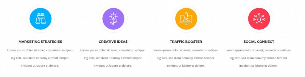
These are the images that are not pixel based, created in a vector program (such as Adobe Illustrator), and are often used on the web in the file type SVG (scaleable vector graphic). They are the best images to maintain a smooth crisp quality no matter how large and, if created and designed efficiently, have extremely small file sizes.
Alternatively, vector-based designs can be exported as pixel-based image files (such as JPG, PNG, GIF) to further optimize and be treated as a regular contained image.
Best practices for delivering a hero or background image
These are generally the hardest to get to their smallest file sizes because by design they are meant to be the full width of the browser (which increases with larger monitors). This makes it difficult to really cut out and compress a lot. So it becomes a question of what is more important to the client: site speed or an immersive visual experience.
Most of the time there is a balance to strike and that’s what optimization is all about. However it is useful to be able to communicate with the client and/or the development team to establish those priorities.
1. Cropping background images
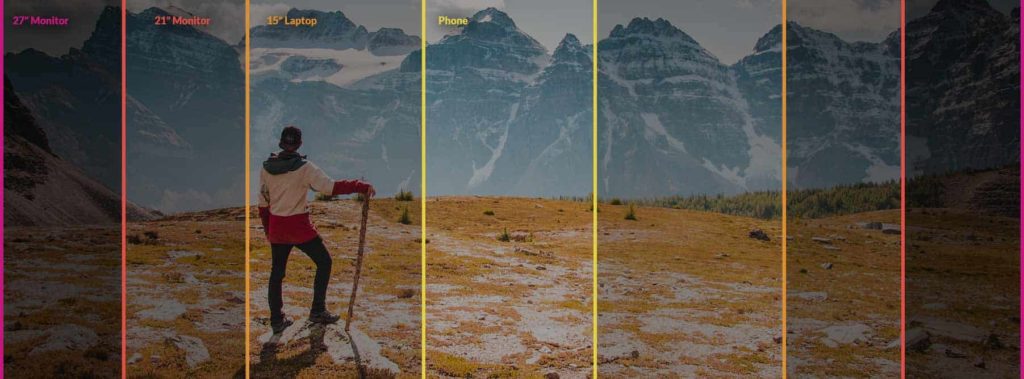
With background images, there is an important fundamental thing to understand: the crop of the image will change depending on what device you are using. Mostly likely, the developers will build the section to be a fixed height. Within that build, there is a large range of display widths that will change the horizontal crop of the background image. In other words, if viewing the site on a large monitor shows your image in its entirety, a small laptop will show that image cut off on the left and/or right sides and only display the content closer to the center.
So how to approach this? Without going too much into responsive design strategy, here are a few suggestions that will help prepare these large-scale image crops for the best outcome across devices:
- Vertical cropping – Focus on cropping the top or bottom to reduce the pixel size, making the image wider in proportion than you intended
- Using “safe space” – If the image contains subjects that are an essential component of the design, leave extra room on the left and right sides to ensure elements don’t get cut off on smaller screens
- Sometimes even extending the image left and right with “blank” space is helpful. And by blank space I don’t mean just white space but more extending your background so it’s just a wider format and the important details are not right on the edges
2. Resizing background images
This part is debatable as there are no specific one-size-fits-all guidelines. It really comes down to that balance of quality vs performance. When resizing these photos, you are mostly looking at the pixel width because that’s the main variable between different browsers, screen sizes, and devices.
A standard high definition monitor will display 1920px wide and large 27”-30” monitors are 2500px wide. So I believe that sizing your image in the range of 1800px-2500px strikes a good balance of maintaining quality across larger monitors, while not being overly bulky. A standard stock photo size could be anywhere between 2000px and 7000px wide, so those ones will most likely need some shrinking.
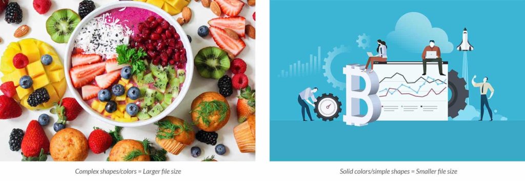
Where you should go in the range depends on the complexity of the photo. A very simple, mostly solid-colored image will inherently have a much smaller file size than a largely-complex photo with many details and colors. So with a simpler image, there is wiggle room to move towards the high end and make the image 2500px wide.
In Photoshop, you can resize by going to Image > Image Size and then adjusting the pixel width. Make sure your link-proportions box is checked so the height is adjusted automatically.

3. Compressing background images
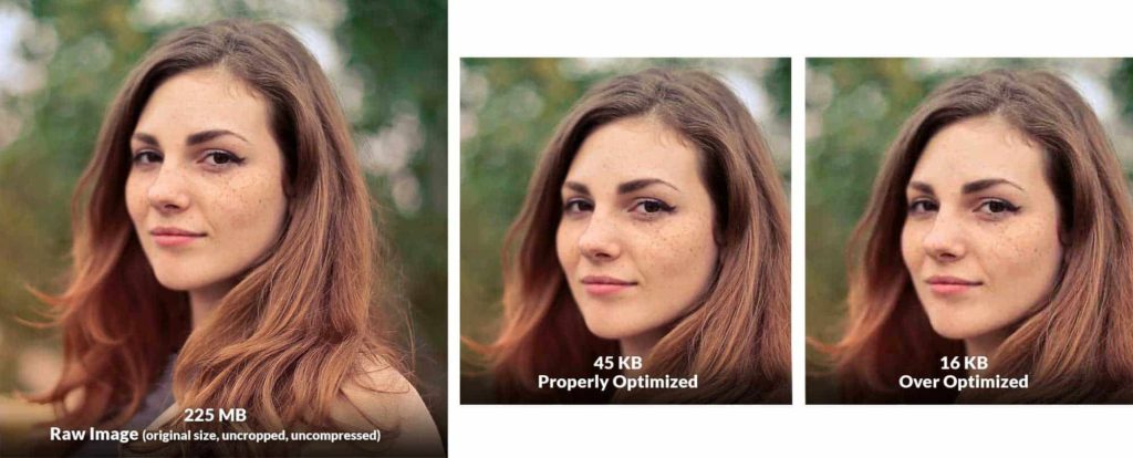
This is the final step in getting the file to its optimal size. Basically, image compression is using advanced algorithms to shed parts of the file away while keeping the parts that you need to keep the image acceptable looking. The way I’ll explain how to do this step is by using Adobe Photoshop, though there are a number of free compression tools available, which are listed later in the article.
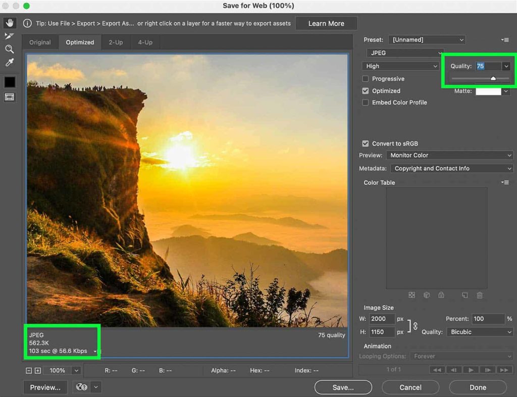
Once your image is opened in photoshop, go to File > Export > Save For Web. This brings up one of the best dialogue boxes out there for image compression. You can save for different file types, such as JPEG, PNG, or GIF, while having the flexibility to adjust the amount of compression in different ways. Your hero image should ideally be a JPEG because those can get a much lower file size than a PNG or GIF (with exceptions).
First you want to start by going to the top right dropdown below presets and select JPEG. The important thing you need to adjust is the quality slider. Here you can move this up or down while seeing a live preview of the image on the left, along with an updated file size on the lower left. The idea is to get the quality as low as possible while still deeming the image acceptable from your point of view. It’s a judgement call and ultimately it’s up to you to decide what’s “good enough.”
Without getting too much into compression, because it’s a whole science, I’ll just give a nice rule of thumb to follow for getting a large hero image ready for the web.
Try to get the file size under 200kb.
Once you go higher than that, the images start to really add to the page-load time of the site. Generally, it’s ok if your quality slider has to dip into the 40’s or even 30’s & 20’s, as long as the preview image isn’t affected too negatively. Go as low down on that slider as you possibly can until it hits that sweet spot where a number any lower is when you start to notice the quality degrade.
Best practices for delivering a contained image
This one is a little easier to get the file size down because they are not intended to stretch the full length of a flexible-width browser. Because of that, the pixel count of the images can be a lot lower than a background image and thus, easier to compress effectively without quality loss.
1. Cropping contained images
This category is the most straightforward crop. If you put a crop on an image inside your page mockup in any way to enhance the composition or change the shape of the original, make that exact crop in the raw file to send to the developers. It’s that simple. But you can’t assume that during the build, a coder will institute your custom cropping if you hand them the original raw file with no edits.
2. Resizing contained images
This comes down to a question of what is most important to the client. Some clients will prioritize site speed over anything else, knowing that there will be a lot of images on many pages.
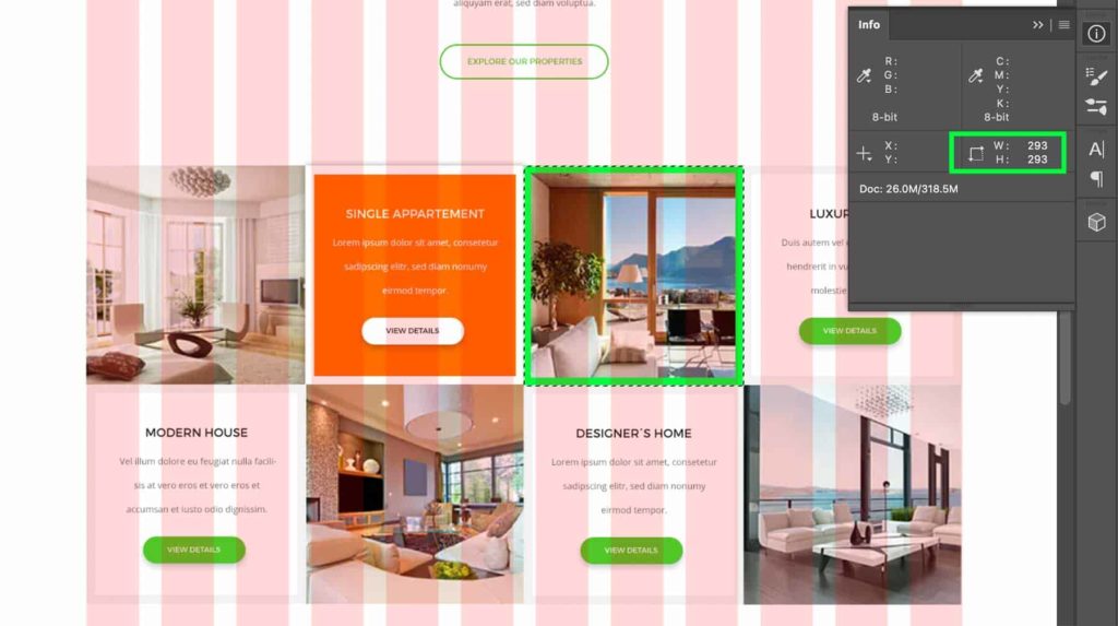
For max site speed
In this case it’s good to size your contained images at exactly the right pixel dimensions you have displayed in your mockup design. If you have your project file set up so that you are working along with guides, grids, or a max width, you should be able to easily find the dimensions at which you sized the image.
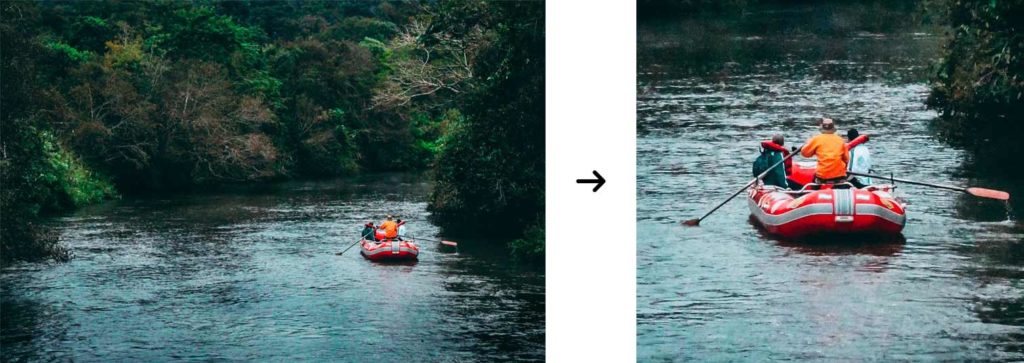
The problem with this is that on some monitors these images may appear a bit fuzzy.
For sharpest image quality
Most of the time a client doesn’t prioritize max site speed over having blurry images for some viewers, so a common practice to account for the blurriness is to resize the image to either 1.5X or 2X the designed size.
So for example, if in your mockup you have an image that is 440x320px, you can resize your original raw image to 660x480px or 880x640px to get ready for the compression step. This should allow the images to display at full resolution on larger retina screens.
3. Compressing contained images
Compressing these images to a low file size without sliding the quality down too far should be relatively easy compared with large background images…as long as you are exporting JPEG.
Exporting PNG for web
You can export PNG files from the same “save for web” dialogue box as you do for JPEG, however there is an extra step to take for effective compression after the photoshop export
In the “save for web” dialogue box select one of the PNG options there for export
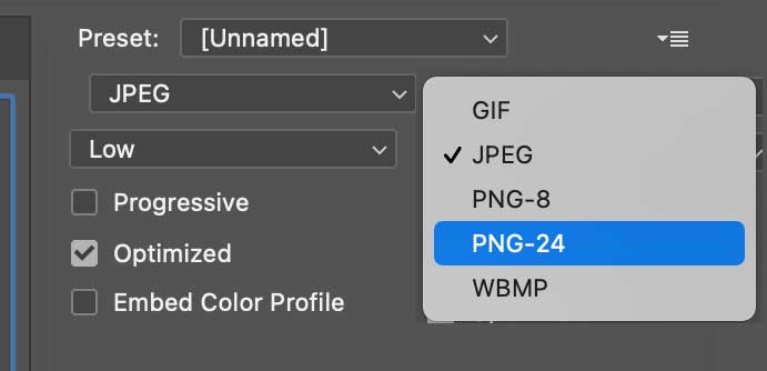
- PNG-8: this is the closest format to a GIF. It includes transparency and has a limited color palette of 256 colors. Because of the color palette, it’s a smaller file size but won’t work well with gradients or photographic images.
- PNG-24: This is the equivalent of JPEG quality but with the ability to add transparency. It works well for higher complexity images with gradients, drop shadows, and photographic color ranges.
Unfortunately Photoshop is not natively equipped with the greatest compression tools for PNG. You may find that you can’t even get a 500px wide image under 200kb, depending on the complexity.
Once you export for web PNG, I would recommend running that new file through a 3rd party application for further compression. The best tool out there I can recommend is TinyPNG. It has a free version where you can upload up to 20 images with a max 5mb each. In my opinion this does a phenomenal job of compressing PNGs to their lowest possible file size without really affecting quality.
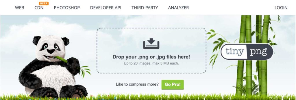
Even if after all the cropping, resizing, and compressing it still has a large file size, it may be worth it to shrink the size a bit and try again.
Best practices for delivering a vector image
These are a little different than the other 2 image categories because they are mathematically-based rather than pixel-based, so you are not making a rectangular shaped file, but rather your file is essentially a block of code inserted into the HTML of the site. For these reasons, they do not follow the same steps as crop, resize and compress.

You’re in charge of the size
It is not so much about the cropping or resizing as it is about conveying the right parameters for whoever is building the site. Since this image is scalable to any size without losing quality, there is an extra step. Be prepared to communicate to the dev team the pixel dimensions (at least the width) because quite often, implementing an SVG image in code will require a width to be manually set. So giving a measurement will ensure elements are sized accurately to your design.
Because there are no pixels you don’t have to worry about resizing to 1.5X or 2X because they would even appear sharp at 100X!
Expand the paths
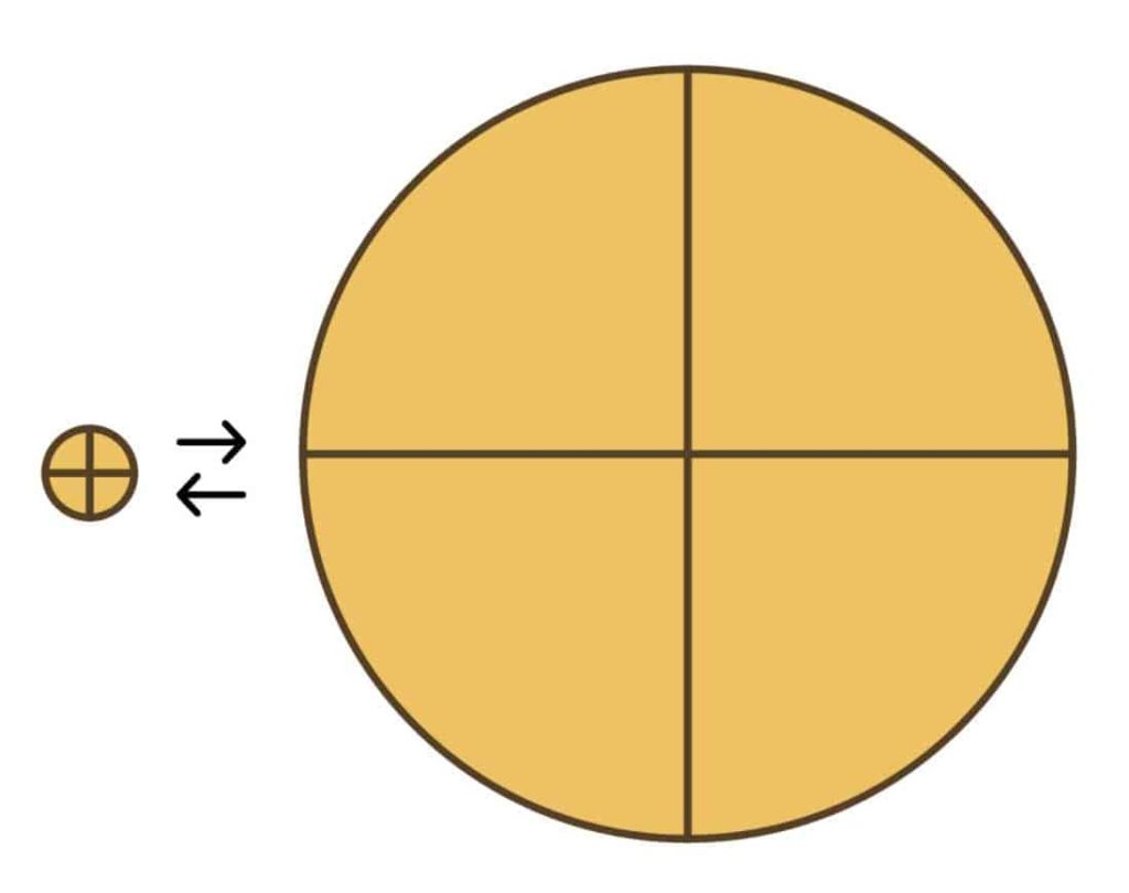
When you use line paths in your vector drawing, those lines are called strokes. A stroke forms a fixed width on your monitor so if you design a small circle with a 1pt stroke width, it will maintain the same width if you scale that circle up on the web…then your line seems way too thin! This also works the other way around where when scaled down, your lines are thicker in proportion than you intended.
There is an easy fix to this and in Adobe Illustrator it’s a command called expand appearance. Before you do this, I would recommend duplicating the design first because once this is done, it makes it very difficult to edit your artwork. So first be sure this is the last thing you are doing before exporting. When you are ready and have backed up your original art, select the whole icon/object (just to make sure you cover all paths and shapes in the design), then go to the top menu Object > Expand Appearance.
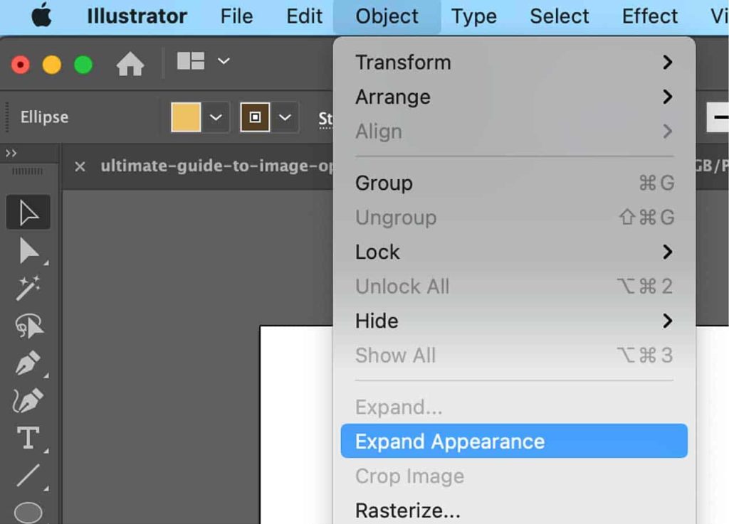
That should do the trick for all the different paths inside the selection and now they have been converted in shapes, which makes it easier to scale up and down.
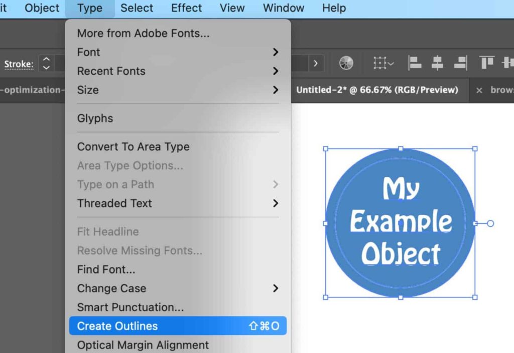
This also applies to text if you decide to include it within an SVG file. Often, a font won’t be recognized or supported by certain browsers, and as a result it will display a backup system font which could have less-than-desirable effects on your image. Having a browser switch fonts may mess up your formatting, line-height, and proportional size because some fonts have their own set of rules when it comes to scaling.
So the best bet is to do the text version of expanding paths which is called creating outlines. If you have text in your image and are working in Adobe Illustrator, select all your text, then go to Type > Create Outlines. This has the same effect as expanding your paths so you will be unable to edit your text as normal after doing this.
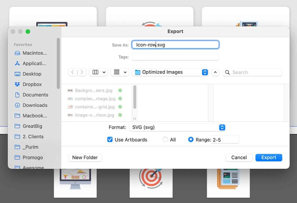
Singular asset export vs artboard export
If you are familiar with Adobe Illustrator, you understand that you can export for SVG either by selecting and exporting as a singular selected asset or by exporting it within a rectangular artboard. There’s a specific reason why this matters:
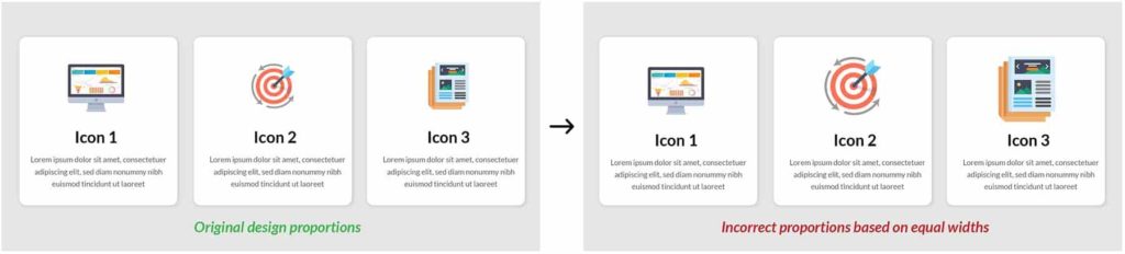
Assigning the same width to, for example, a series of icons to be displayed horizontally in 3 columns will actually come out differently than you expect. This is because your icon shapes are irregular and their width/height ratios are varied. So telling your developer that all these icons should have the same width will make some bigger or smaller in comparison than you intended.
Yes you can just measure the width (and height) of every icon in your mockup and give a unique pixel width to each one, but allow me to offer a better technique:
Create 3 new square artboards (or however many are included in your icon group) that are slightly larger than the icons. So if your largest icon is 180x120px, make your new artboards 200x200px. Now copy over all your icons into each of those artboards and place them directly in the center.
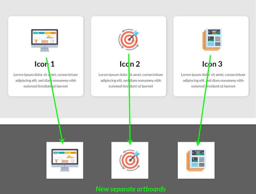
When you are ready for export, take note of the artboard numbers/titles and go to Export > Export As. In the dialogue box select the format SVG from the dropdown, check the Use Artboards box, then select the range of artboards you want to save, and click Export.
This will ensure that all the icons are represented in the correct proportions relative to each other and the dev team won’t have to spend extra time tweaking things. Believe me, they’ll appreciate that!
Additional image optimization options
If you are unfamiliar with Photoshop and just need to take some images and do some quick cropping, resizing and compression, there are many free (or freemium) web based apps out there to get the job done!
Free online tools for cropping, resizing, and/or compressing images
https://resizeimage.net/
https://picresize.com/
http://www.simpleimageresizer.com/
https://www.iloveimg.com/crop-image
https://photoshop.adobe.com/crop?promoid=T32PLWNG&mv=other
https://www.befunky.com/create/resize-image/
https://tinypng.com/
https://www.img2go.com/resize-image
http://www.imageoptimizer.net/Pages/Home.aspx
https://imagecompressor.com/
Some more tips and tricks for image optimizing!
- Looking into next-gen image formats.
- Image formats like WebP are the future for websites. WebP has superior compression and quality compared to jpg and png, but browser support is limited and images require a fallback image. We’ve played around with WebP and we recommend using Adaptive Image plugins from Shortpixel.
- We will most likely publish an article surrounding this in the near future
- Image formats like WebP are the future for websites. WebP has superior compression and quality compared to jpg and png, but browser support is limited and images require a fallback image. We’ve played around with WebP and we recommend using Adaptive Image plugins from Shortpixel.
- Get creative with combining your image layers in photoshop
- If you have images on top of each other, simply combine them into one image to minimize the amount of exporting and requests required from loading the web page.
Instead of exporting background images and colors without gradients, include them in your image and limit the margin of error for a developer in getting the placement and color of those overlays just right.
In conclusion
The main thing I want to stress in this article is that image optimization is essential for successful websites and as the web designer, it is in your best interest to make sure the asset preparation and communication with the development team is thorough and clear. This will make for the best situation for everyone and help to achieve the best results possible!
If you’ve made it this far in the article, I thank you and recommend that you take this article and crop, resize and compress it! Then after that you should add to the comments and let me know if I missed anything or if any step was unclear, or if you have your own technique or workflow you’d like to share.

About Great Big Digital
Achieve your website goals with customized data, intuitive UX, and intentional design.