Our April Fools Website

Remember What the Internet Used to Look Like?
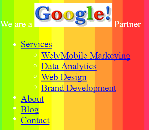
Worst. Site. Ever.
This April Fools Day we set out to make the worst site ever. Since humor is a large part of the Grue & Bleen philosophy, we wanted to create something that shows that, while we are a serious company, we definitely have a fun side. Back in school we learned that breaking from convention was encouraged to spawn creativity, as long as you had a solid understanding of what the rules were and what they were trying to achieve. I don’t think this is what our teachers had in mind.
Drawing from our knowledge of horrible UX, bad content, and internet no-no’s. Here are the elements we included in our site-of-sites:
Make Sure There is Sound
Nothing makes someone hate a website more than forcing sound on load. So obviously, we had to put sound on the site. Not just sound, but a terrible midi rendition of the Titanic song. Never let go of that audio, Jack (hehe).
Follow the User’s Mouse
We wanted to annoy people as much as possible, so of course we needed something that follows their mouse around where-ever they move it. No matter how hard you try, there is no escape!
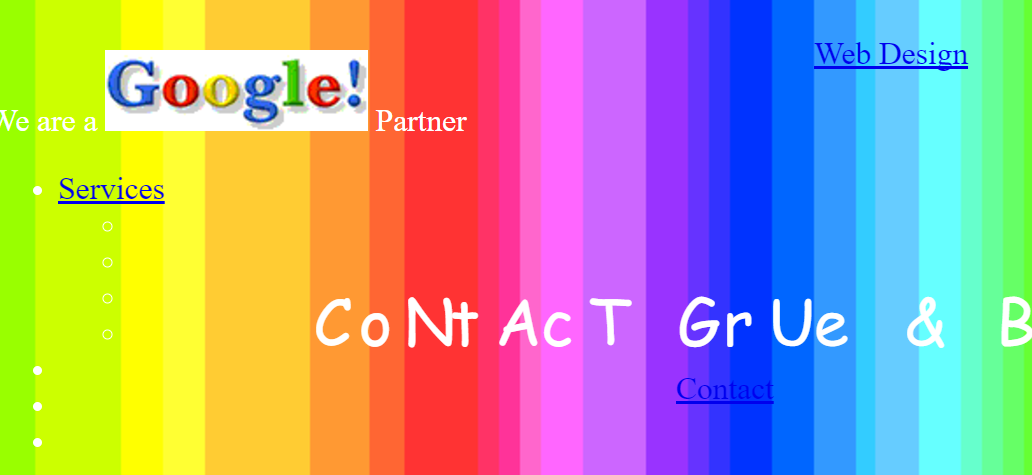
What’s a Line Break?
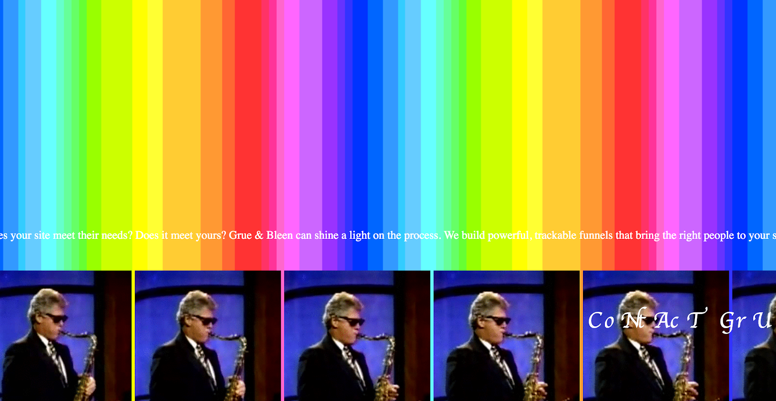
So much of web design is based on a top-to-bottom scroll. What worse way to make someone’s day is there than to make them scroll over forever? The torrential downpour of tears from your eyes won’t clear up, despite the rainbow.
Incorporate the Finest ‘90s Screensavers
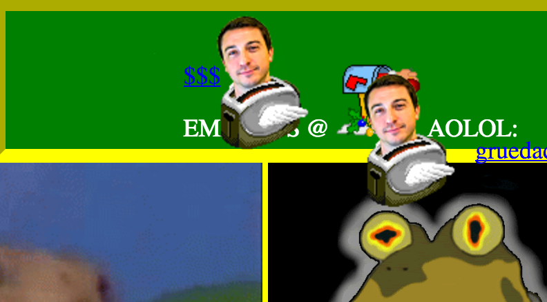
If there ever was anything that was iconic about the internet of the ‘90s, it had to be toasters with wings. Swap out some of their delicious toast with a mind-numbingly fast face-blend gif and you got the true icon of the ‘10s!
Make Everything Super Unclickable
What good is a website if you can’t get see what’s on it? Exactly. Try clicking something. We dare you. Our content has got more moves than a Jabbawockeez concert.
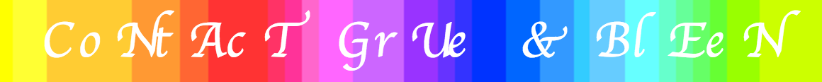
Use the Greatest Fonts in Town
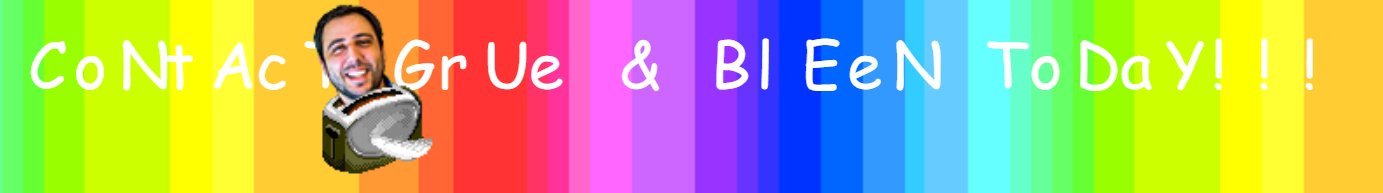
Comic sans. ‘Nuff said. Alright, a little more. Who invented that??? Who ever thought that was a good idea???
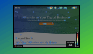
Honest Call to Action
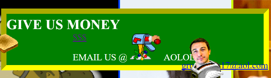
Websites all need a clear call to action for the users, but usually they are a bit subtle about it as they send their users through a well-thought-out and carefully crafted sales funnel. Yea, we didn’t beat around that bush here.
Auto Scroll
You know what everyone loves about websites? Letting them take over and stop you from doing whatever you were doing (even on a website as terrible as this one). Just when the Titanic song starts growing on you, Bill Clinton’s saxy serenade pulls you even further out of your comfort zone!
April Fools FTW!
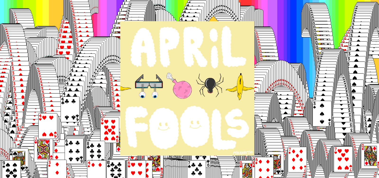
What would a ‘90s throwback be without the most exhilarating ending the world of digital card gaming has ever seen? For putting up with this site, (and braving the potential epileptic dangers,) you earned it!

About Great Big Digital
Achieve your website goals with customized data, intuitive UX, and intentional design.